UX Case Study
Mobile app concept for new and transfer college students to guide them through the admission process.
Challenge: The University of Texas Rio Grande Valley (UTRGV) is a new brand University part of the UT System and founded in 2015 by the merge of The University of Texas Pan-American (UTPA) and The University of Texas at Brownsville (UTB).
Senior high school students looking for information to get admitted to UTRGV get lost in the new university website and they prefer to go to the admissions department and ask in person, returning home with a couple of flyers and a lot of questions. The information on the flyers is explained in a different way than in the website.
Prospect students feel insecure, unsure if they are covering all the admission requirements. The lack of accessibility to clear information is a problem since a lot of students do not live close to one of the campus, they are internationals applicants, or come from other states.
In addition, not all prospect students at UTRGV are freshman, many of them come from other universities and are considered transfer students, which have a different admission process.
Objective: Offer clear information to future UTRGV students about entering freshman and transfer admission process.
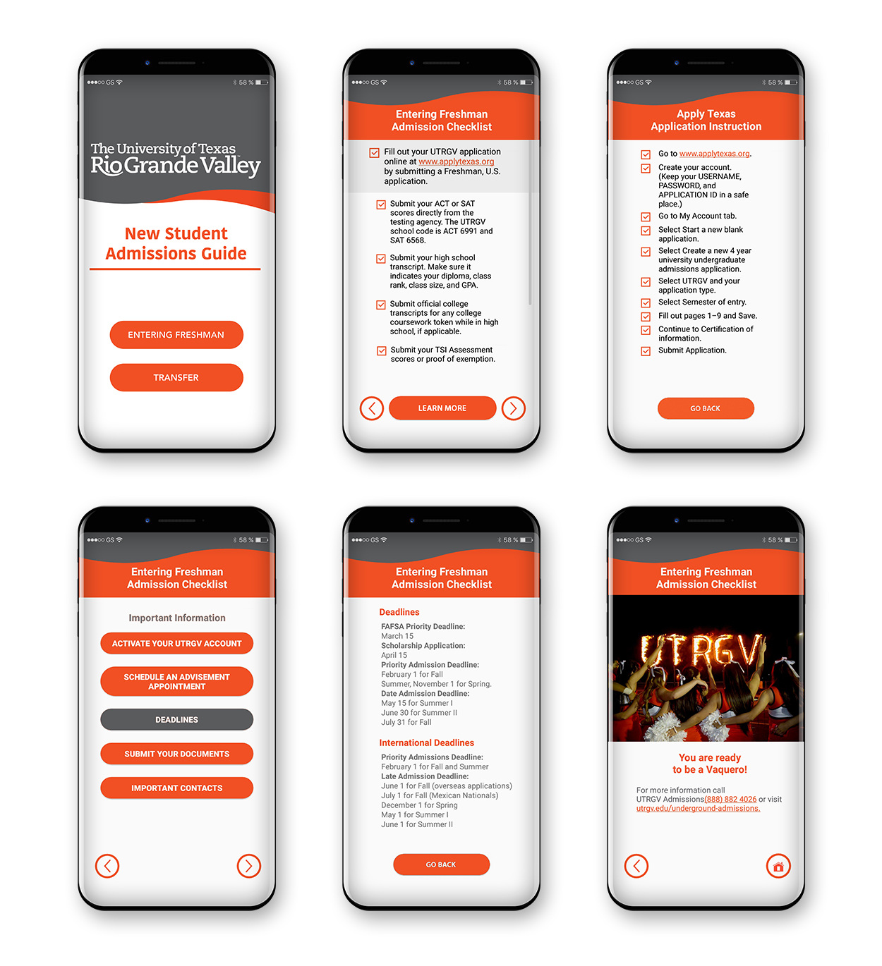
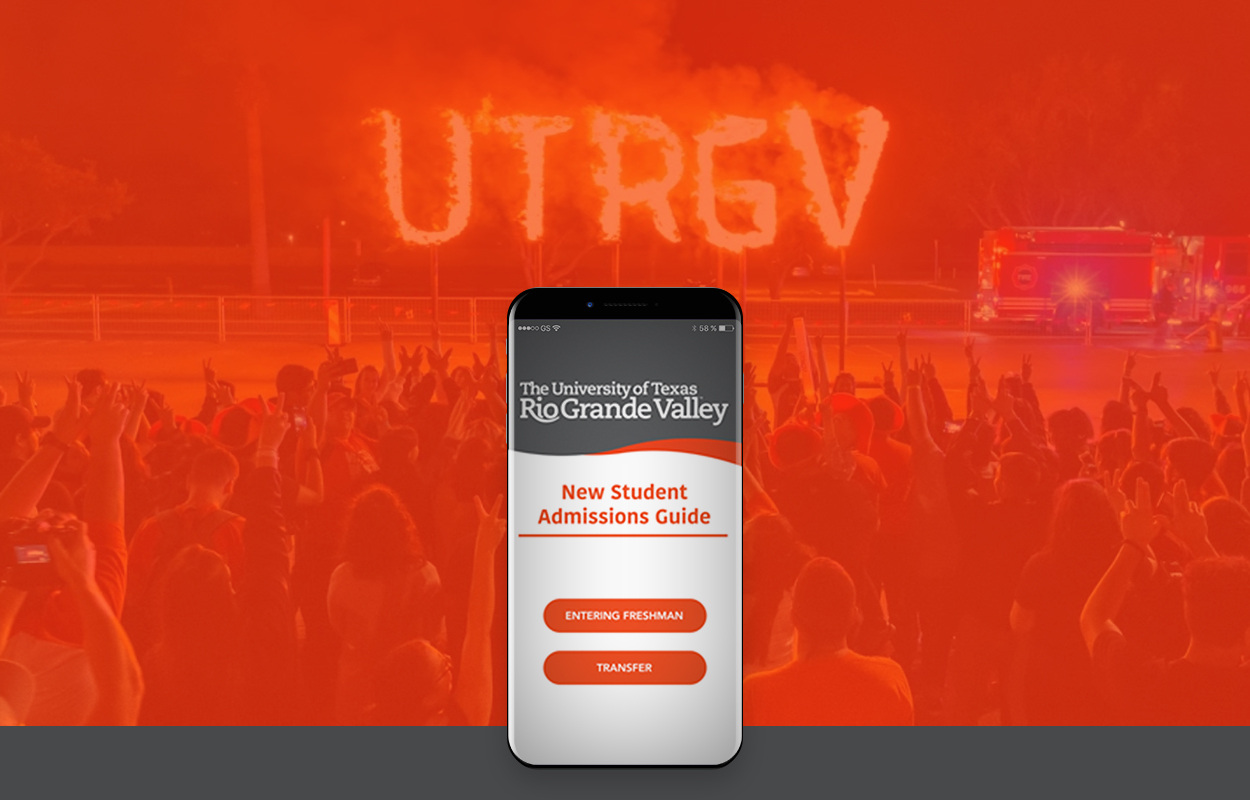
By creating a mobile app for UTRGV Admissions, prospect students would access from their phones to an informative guide that will include frequent admission questions, checklists, requirements, important contacts, deadlines and more, making the process easier for them.
The app will ask whether a student is an entering freshman or a transfer student, and from there, it will drive them step by step. It will also offer important information, and how to contact the admissions department in case they still have questions.
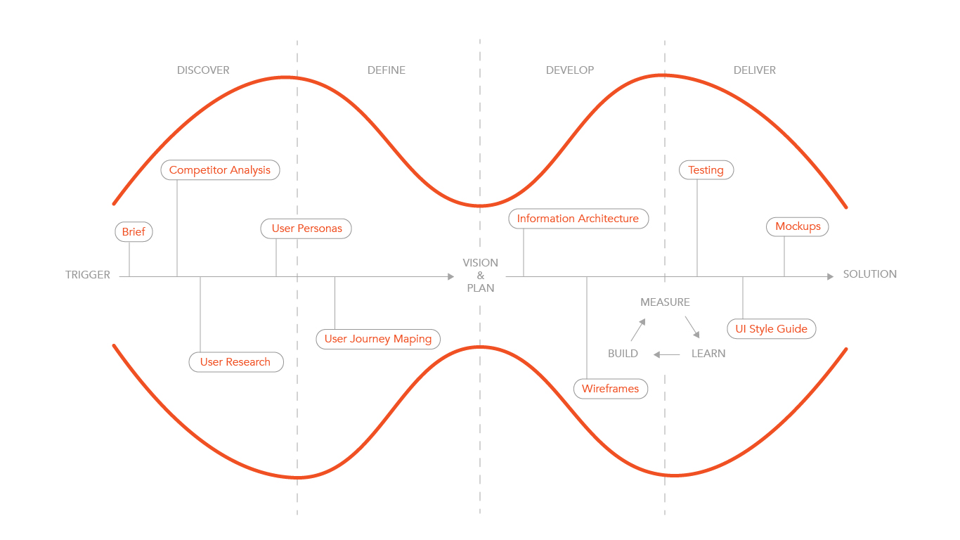
Design Process Overview
Methodology: I implemented two design processes, the Double Diamond and the Lean Design combined.
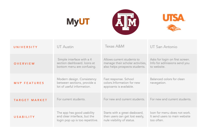
Competitor Analysis
The analyzed competitors do not have an exclusive app for admissions, however, two of them include a section for prospect students in their applications.
Surveys and Interviews Results
I did an analysis of the UTRGV application process, the online surveys and the user interviews with future and current students who have had a bad/difficult experience and a hard time applying for college. I wanted to understand their motivations, goals, and frustrations when it comes to apply for UTRGV college.
I learned from the interviews that users dislike the repetition of information, they do not like to go to hundreds of pages to ended up not finding what they need for the process, they want control and simplicity, quality over quantity information, and they dislike feeling overwhelmed not knowing if they have to follow the website, the flyers or the staff people over the phone.
After processing this information, I worked on the next phase when I developed the personas, created a user journey mapping and a task model.
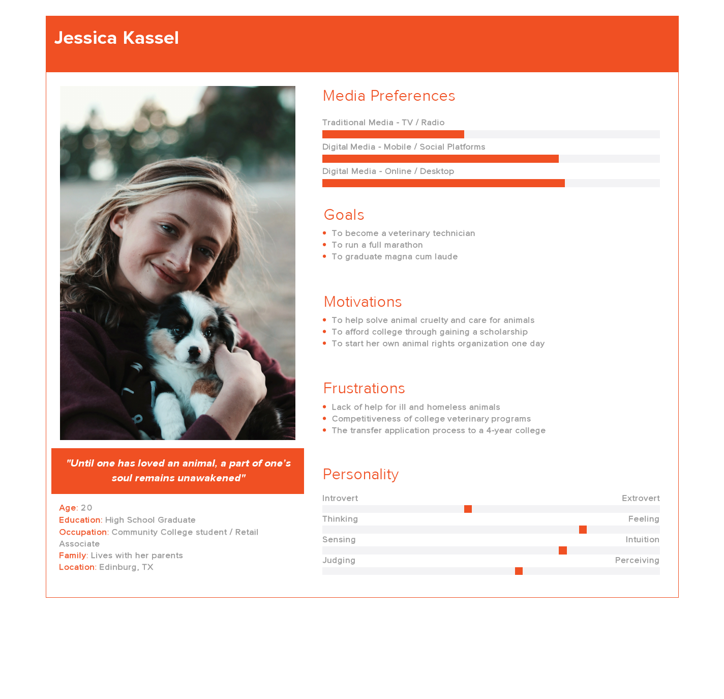
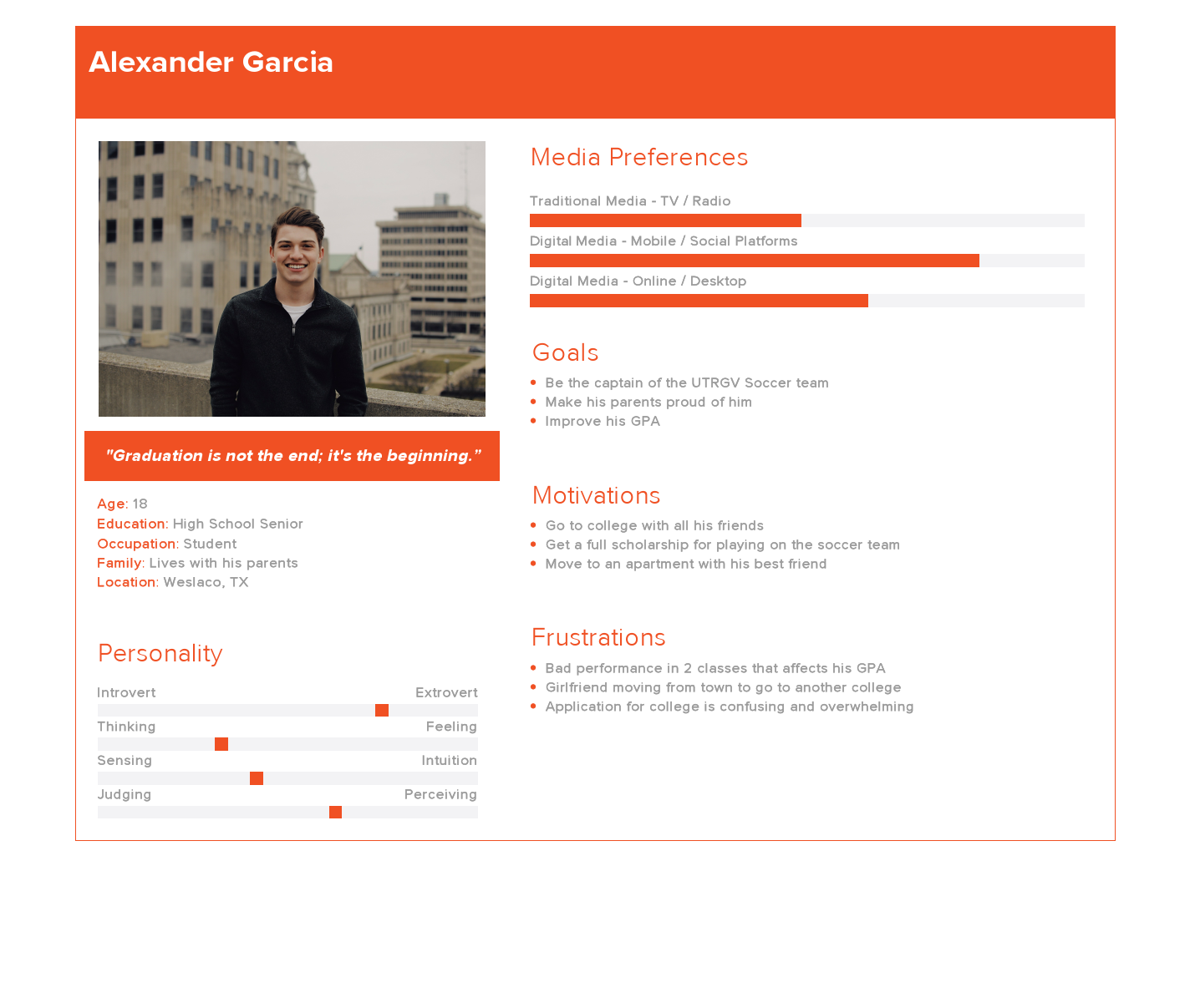
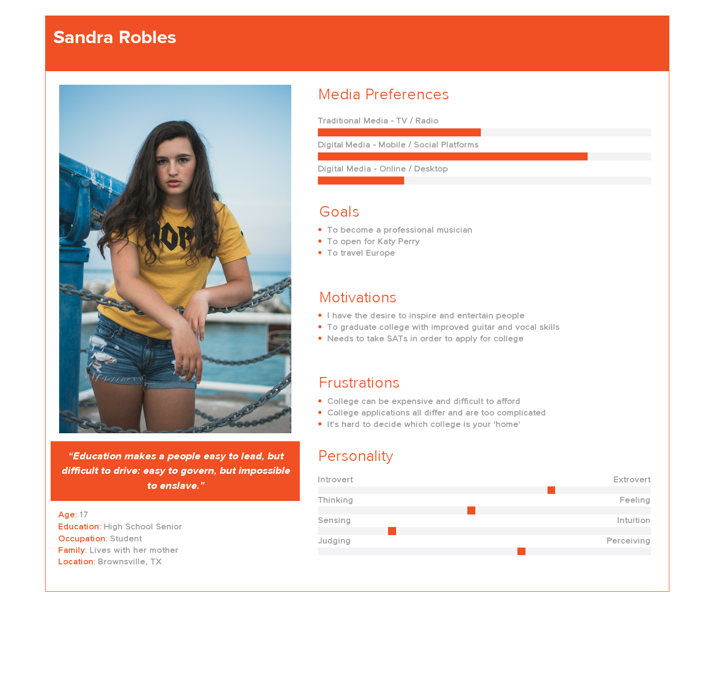
User Personas
With the data gathered from comparative analysis and user interviews, I created 3 personas to make design decisions, priorities and develop empathy with future users.
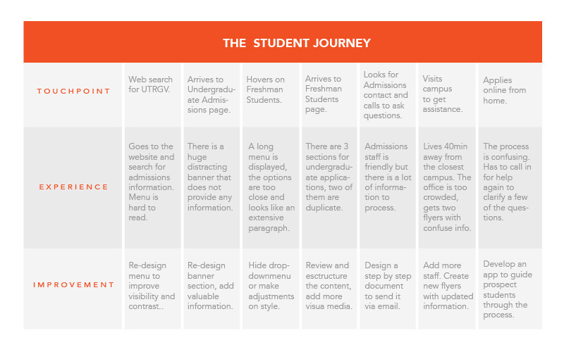
User Journey Mapping
The story of a student’s journey through the admission application process.
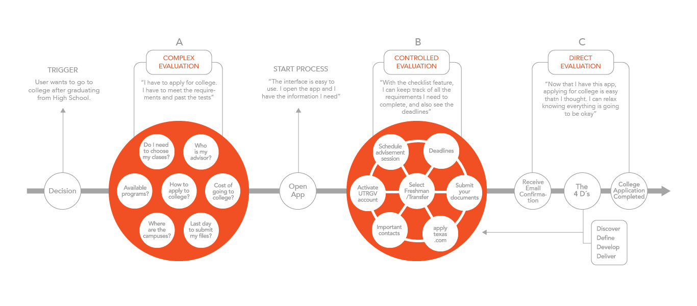
Task Model
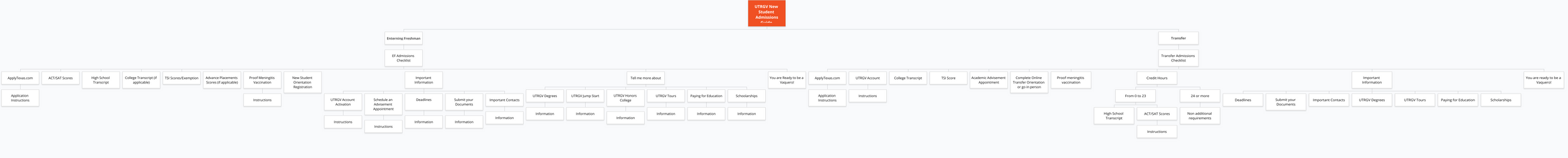
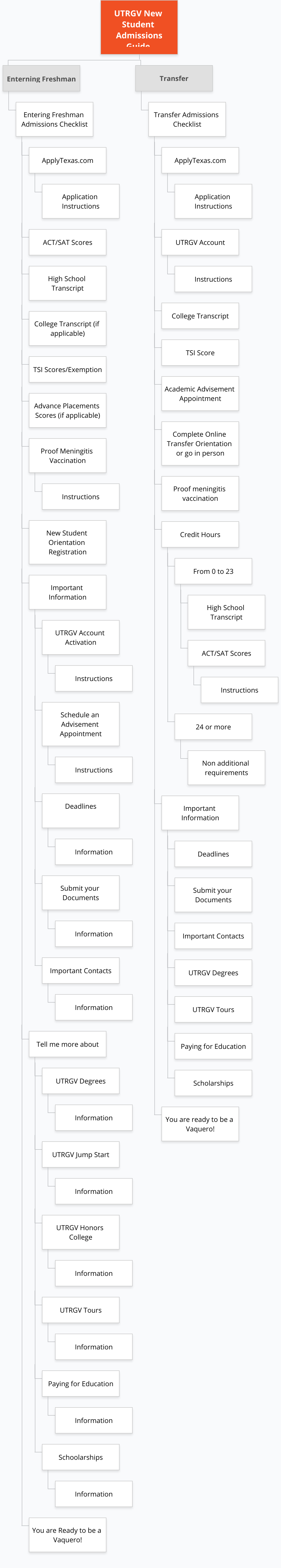
Information Architecture
Site Map
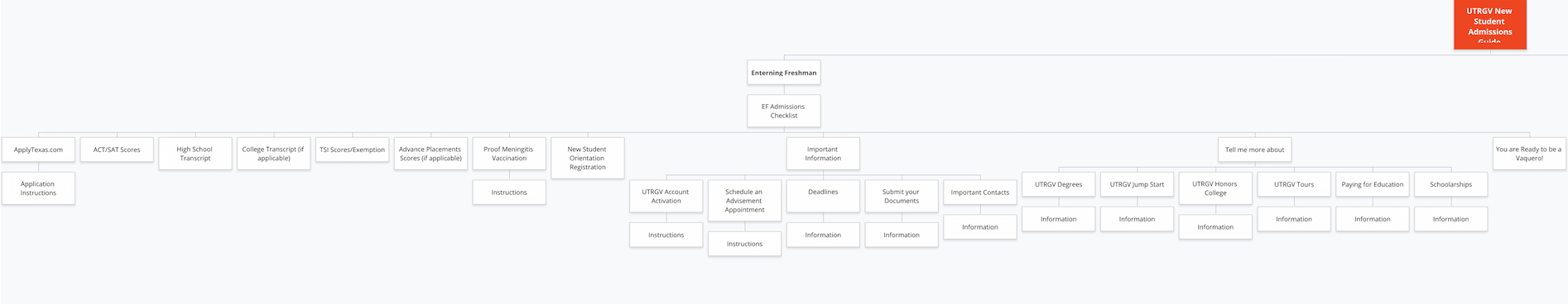
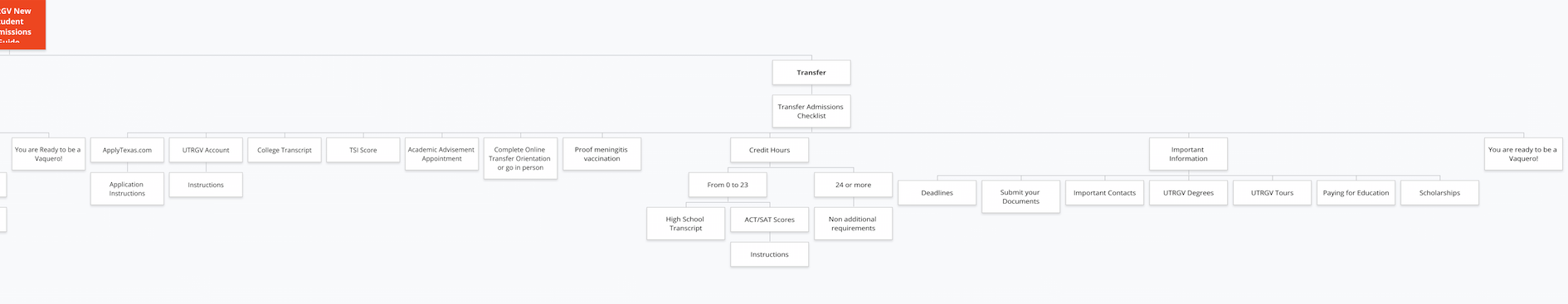
Matrix Model
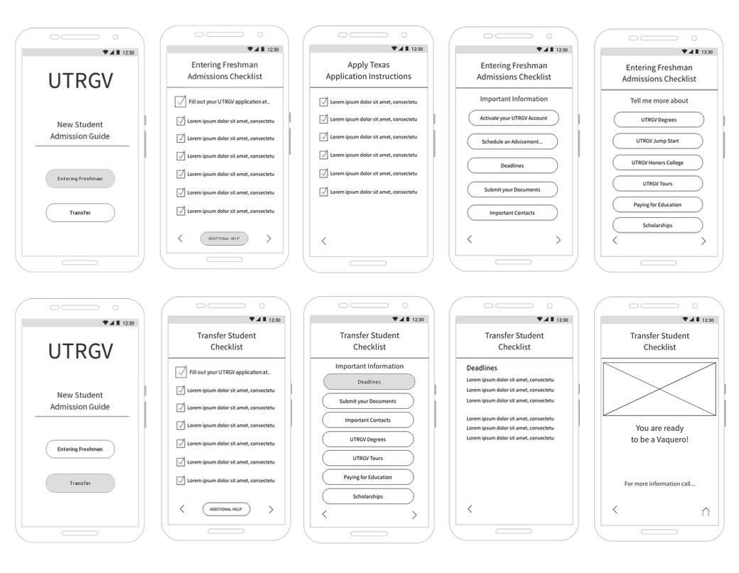
Wireframes
Testing
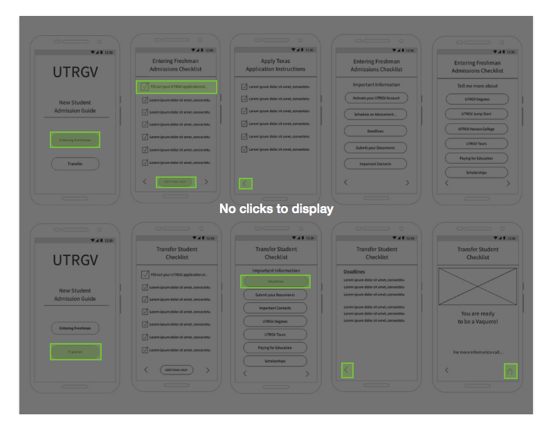
I conducted a navigation test on Usability Hub to determine if the flow of the screens were easy to follows by users. The screen below shows the test after I set it up, I added some hit zones to see if the users would click there. I discovered that the arrows where somehow confusing when only one was presented in the screen, I also noticed that ¨Aditional help¨ was not clear, these changes where addressed in the final UI design.
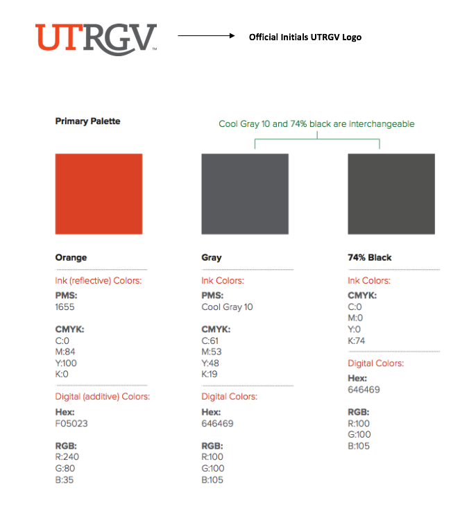
UI Style Guide
Mockups